
Autumn Color Palettes
Autumn palettes borrow from turning leaves, harvest food and low golden light: rust, amber and ochre, grounded by moss green and deep brown. They feel warm and comforting, and they work for seasonal campaigns, food brands and cozy interiors.
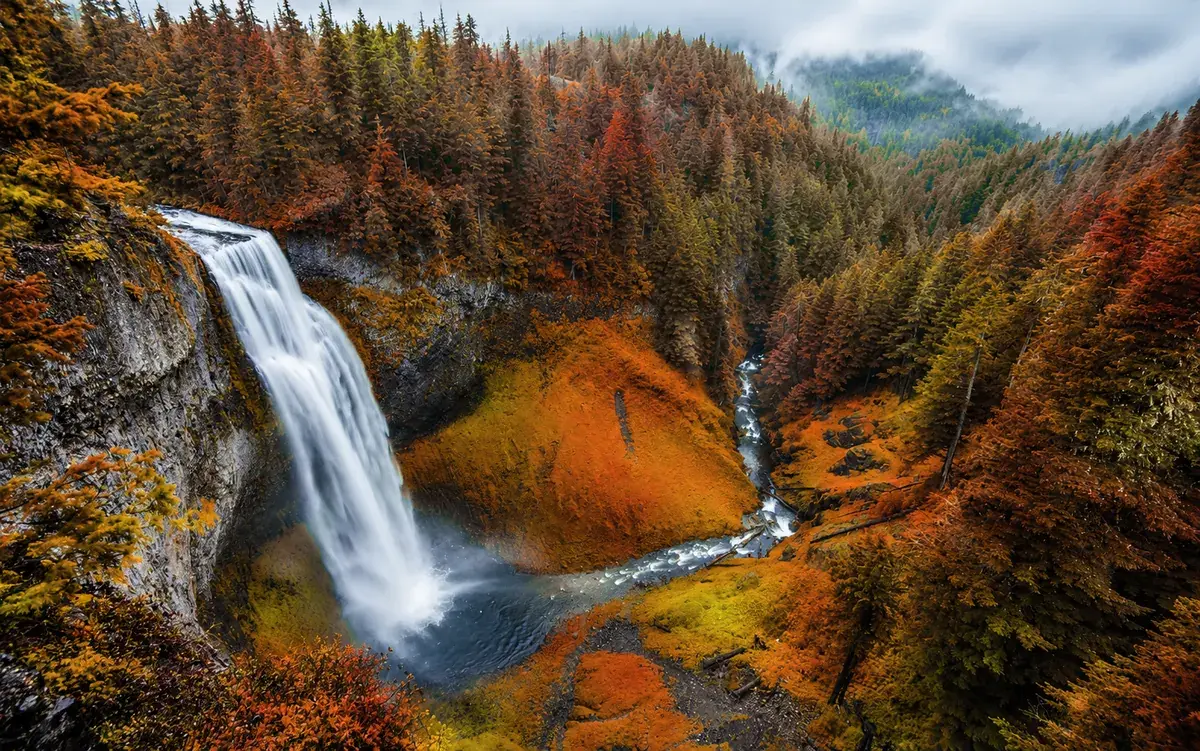
The palettes
- Chocolate#5B2A1ABrown#9C4A1AOrange#D27D2DSun Yellow#E8B04BBeige#F3E3C3
Harvest Spice
Cinnamon and turmeric warmth for food brands and menus.
- Chocolate#3B1F1AMaroon#7A2E1FBrown#C0502DPeach#E5A65ACream#F6EAD8
Maple Lane
Maple reds and oranges for cozy editorial layouts.
- Chocolate#2A3326Charcoal#4F5D3AMoss#8A7A4BTan#B8925ABeige#E7DCC6
Forest Floor
Moss and bark tones that feel earthy and calm.
- Chocolate#6B3A1EBrown#C26A2BTangerine#F0A43APeach#F7D07ACream#FFF4DC
Golden Hour
Glowing amber light for photography and travel.
- Chocolate#5C1A2BCrimson#9B2F45Dusty Rose#C97B84Tan#A3B18ASnow#EEF0E6
Cranberry & Sage
A festive red softened by muted green.
- Chocolate#2E1F2BPlum#5A3550Taupe#8C5A6ESand#C7A2A0Blush#F1E6E1
Smoky Plum
Dusky plum for evening events and beauty products.
How to use these palettes
- Balance the warm oranges with one cool or muted color, such as sage or plum, so the palette doesn't feel heavy.
- Use cream instead of pure white. It keeps the warmth going.
- Dark browns make softer text colors than black on these palettes.
See It in Use
The same palette on a website, an app and a poster. Pick another palette to compare.
Other seasons
Ready to create something beautiful?
Turn your inspiration into a beautiful color palette.